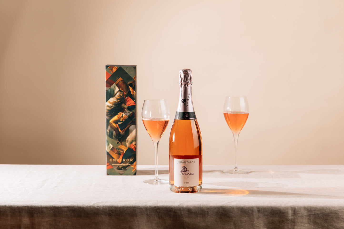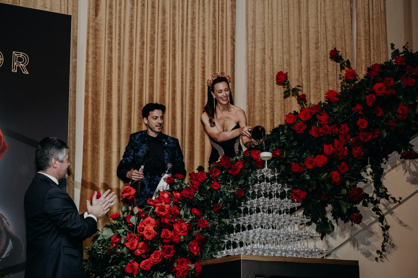
A bottle of champagne is more than just a bottle of champagne when it comes from Emperor.
Emperor knows champagne. We know that it’s a precious commodity, that it’s taken years of artisan craftsmanship to create, and that on many occasions the memory of it’s consumption will last a lifetime. This is why we treat champagne with an unrivalled amount of respect and why it’s our passion to enhance your champagne experience.
There is no place for a brown paper or nasty holographic gift bag in your champagne memory. You’re celebrating, indulging in one of life’s true luxuries. You and your champagne deserve the best. You and your champagne deserve Emperor.
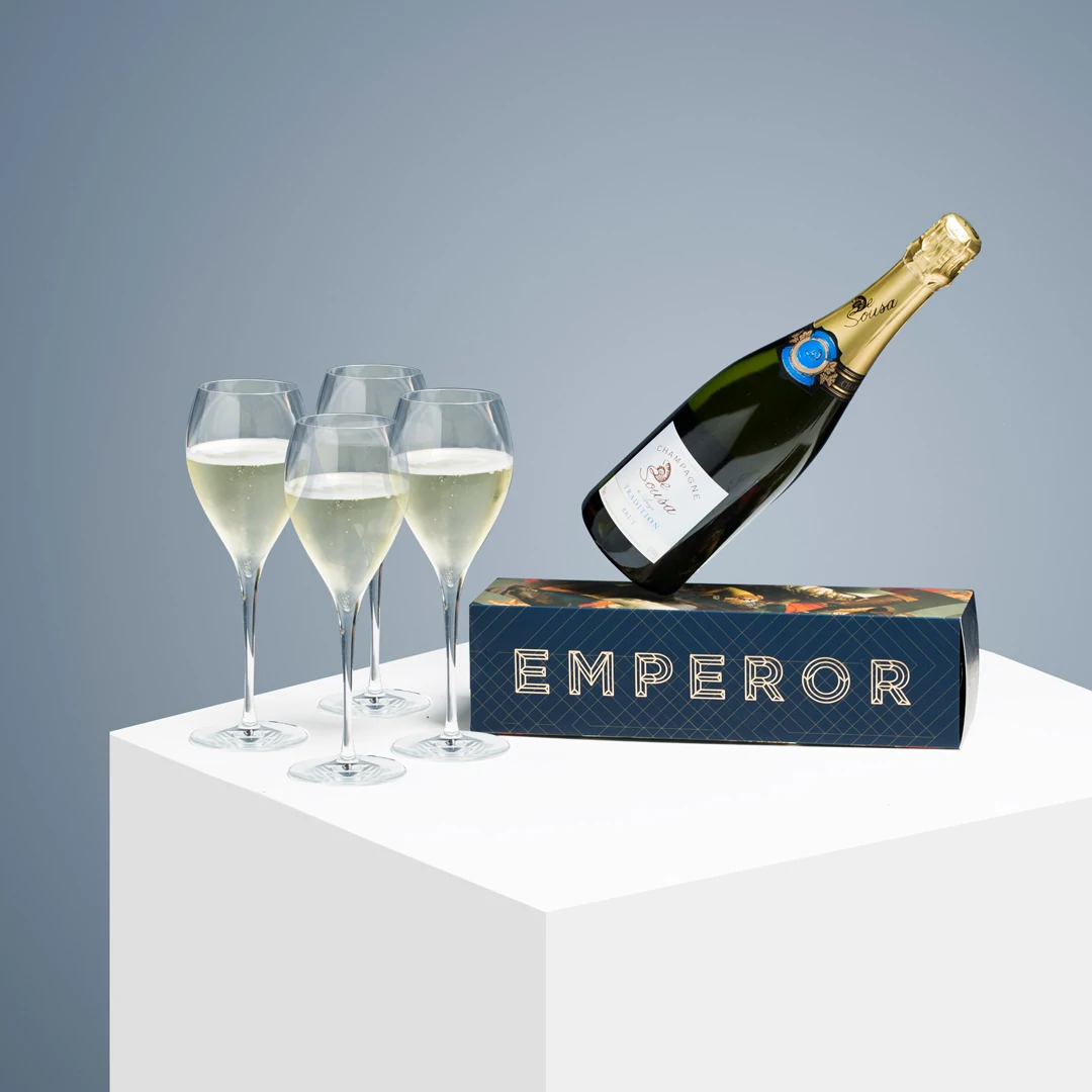
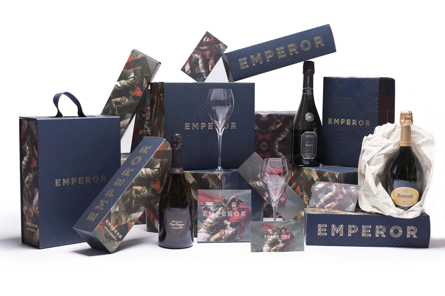
The concept of opulent packaging and treating champagne with the esteem that it commands was pivotal in the creation of the Emperor brand. Kyla engaged coveted Melbourne agency Principle Design to form the visual identity of Emperor, our online Champagne retailer, leading the way for outstanding design by a liquor retailer.
Our CEO and founder Kyla Kirkpatrick left her life behind and devoted herself to Champagne after reading a story about Napoleon Bonaparte and his connection with Champagne and the young Jean Remy Moet. Its only natural then that Napoleon took title honours for our new Champagne emporium.
Here is the story behind our luxury branding and packaging.
Taking influence from both the power of Napoleon and his quote: “In victory, you deserve champagne. In defeat, you need it!” we were inspired to craft a brand that blended the power of the Napoleonic rule with the style and finesse of champagne.
Inspired by a visual vernacular that has evolved over hundreds of years, we created an engaging brand story that modernises iconic heraldic imagery to be bold, memorable and welcoming.
The typographic mark draws influence from the carved type seen on stone Champagne Markers. This beautiful craft has been referenced and re-articulated to create a striking and bold logotype that informs much of the secondary language styling.
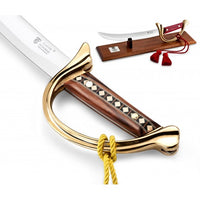
In addition, patterned elements were generated with reference to the ceremonial art of Sabrage, wherein Napoleonic soldiers would open Champagne bottles with a saber or sword. The sharp angles and sliced segments of imagery evokes the swift and powerful movements produced by the sabering technique whilst creating a contemporary mosaic motif.
We crafted the packaging suite to truly embody the art of gift-giving and celebration, by utilising tactility, rich colours and elegant foiling to deliver a high-class product that anyone would be proud to bestow.
Our striking colour palate and design stems from a famous painting called Napoleon Crossing the Alps, painted by Jaques-Louis David in 1801.
Nominated for the Melbourne Design Awards, You can show your support for our project HERE.
